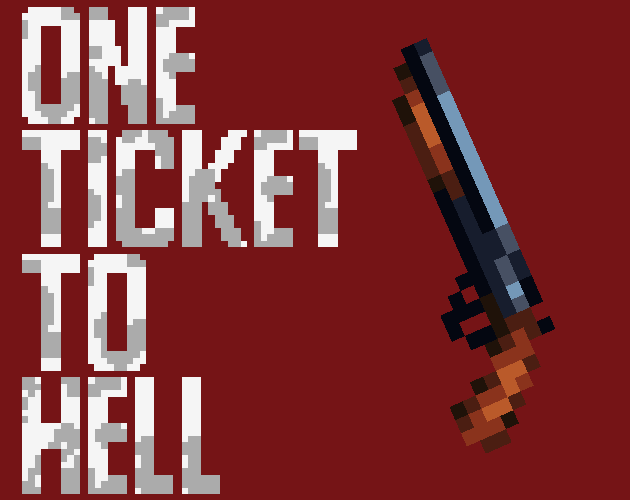
One Ticket To Hell
A downloadable game for Windows
Download NowName your own price
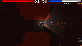
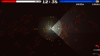
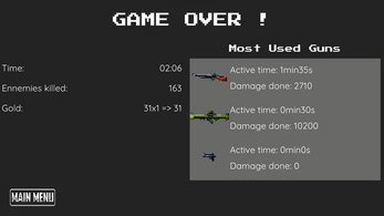
This is a Demo version, One Ticket To Hell is a game inspired by the likes of : Magic survivors, Vampire Survivor and 20 minutes till Dawn. The goal of the game is to last 30 minutes and Slay the final Boss. With 10 levels of increasing difficulty, 6 different characters, many Power ups, even more unique Items and more to come, Here is your One Way Ticket To the Nine Circles Of Hell.
| Status | In development |
| Platforms | Windows |
| Rating | Rated 5.0 out of 5 stars (1 total ratings) |
| Author | Piesanslit |
| Genre | Action |
| Tags | Roguelite |
| Average session | About a half-hour |
| Languages | English |
| Inputs | Keyboard, Mouse, Gamepad (any) |
Download
Download NowName your own price
Click download now to get access to the following files:
OneTicketToHell.zip 29 MB
Development log
- Unique Weaponry & LvL RevampJul 08, 2022
- Changed Main cameraJul 01, 2022
- Lightened UIsJun 30, 2022
- Changed stats scalingJun 29, 2022
- UI ChangesJun 29, 2022
- Minor balance updateJun 29, 2022

Comments
Log in with itch.io to leave a comment.
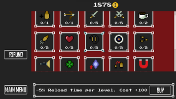
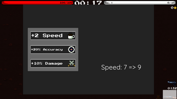
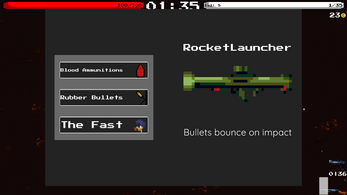
Pretty good, but the UI, oof my eyes, it will be such a great game when you improve the UI. Because I can't play it, there's too much going on at the same time...
Thanks for the notice, will work on that, is there a specific UI that is too much or in general throughout the game?
Don't get me wrong, I like your game, it's good, but requires improvements to become great.
It's uncomfortable *for me* in general.
The things below are probably what makes it uncomfortable for me.
- Everything is probably too big
- Font is purely a personal preference, but the wide bold pixel font used everywhere at the moment is a bit bad. It's bold so it's meant to pull a bit more attention than a usual font would. Everything is written in "significant" font, so my eyes are pulled towards... everything? Maybe you should make the regular font less prominent? Like use a less "significant" font probably.
- Too many buttons in the main menu. You could probably put credits & settings into options, and then controls into settings.
- The title in the main menu is a bit too big. I mean, sometimes it's good to leave some spare space. Like, the "quit" button in the main menu doesn't have to be in the left bottom corner.
- I think that Picasso was right when he said "Good artists copy; great artists steal". Look at other games, how did they do UI? I think that without much experience all you can do is to look and learn.
Overall, good game, I like this kind of games. I like the choice of music, how it changes through scenes.
Thanks for your reply, will work on that !
Wow, now it's very fun to play!
Glad to hear that! Thanks again for your returns, if there is anything else do not hesitate.